Not "how do we build a movie website" — how do we build a universe that can keep growing.
PVCU is Prasanth Varma's shared universe of superhero and mythology-inspired films — the site's job is to showcase his work across past, present and future: earlier films already released, the current box-office hit, and titles still to come. The real question wasn't how to promote the next release — it was how a growing catalogue of films, each with its own visual identity, could sit inside one coherent system that still felt cinematic.
It also isn't a content site alone. PVCU sells custom-made merchandise — clothing tied to the universe — through its own Shop, so the experience had to work as both a discovery layer for the films and a legitimate commerce channel, without the shop feeling bolted on to a movie site.
I worked across both sides of this build: the research and UX decisions that shaped the structure, and the visual system and front-end implementation that carried it through — the shared navigation, the reusable movie-hub template, and the film-specific identities layered on top of it, designed responsively across web and mobile.
One universe. Every film.
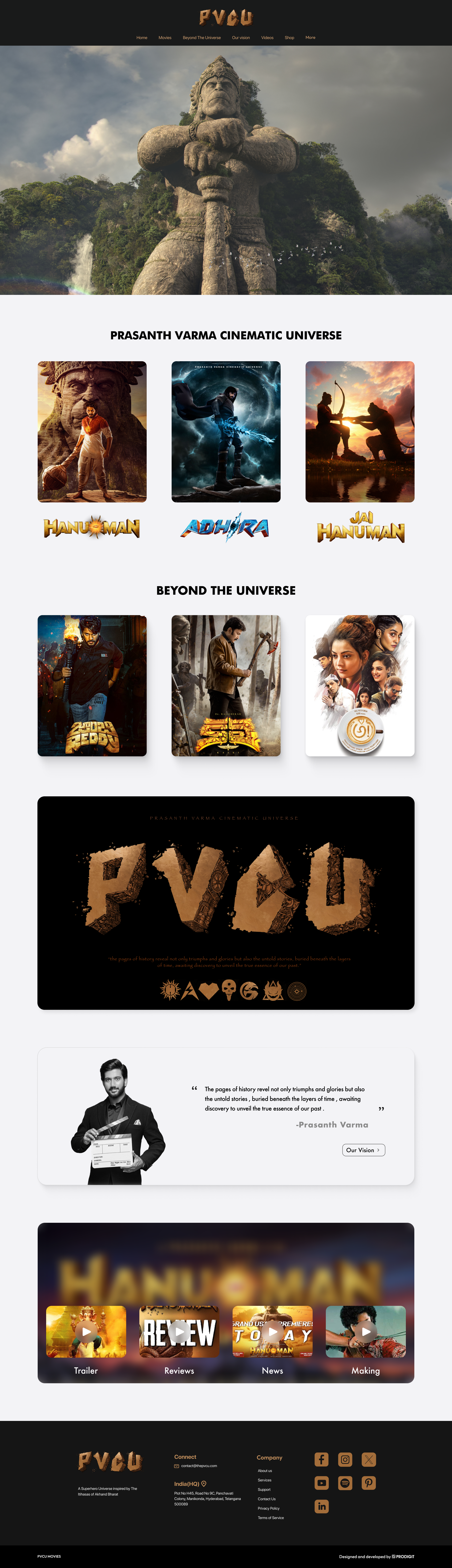
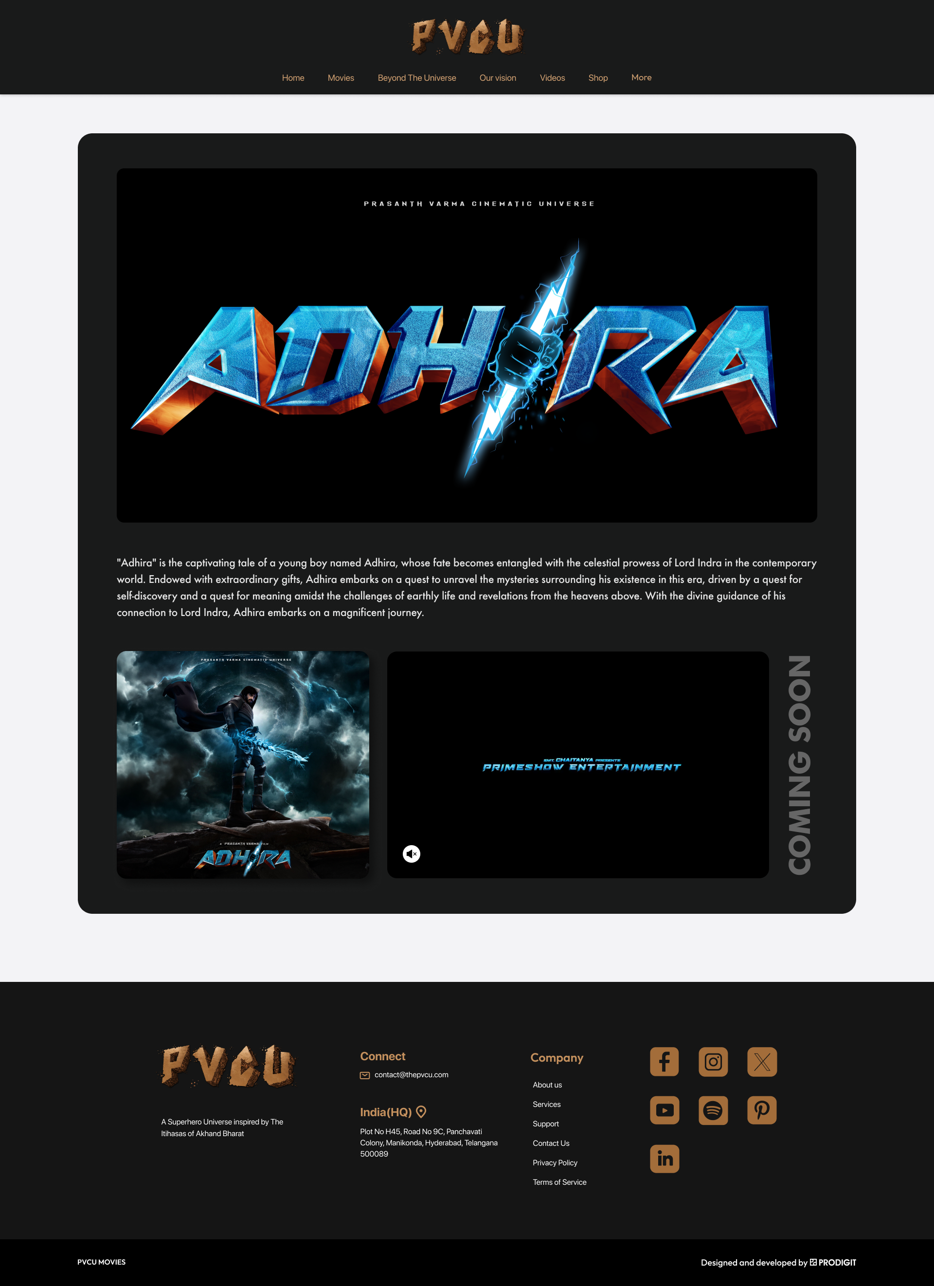
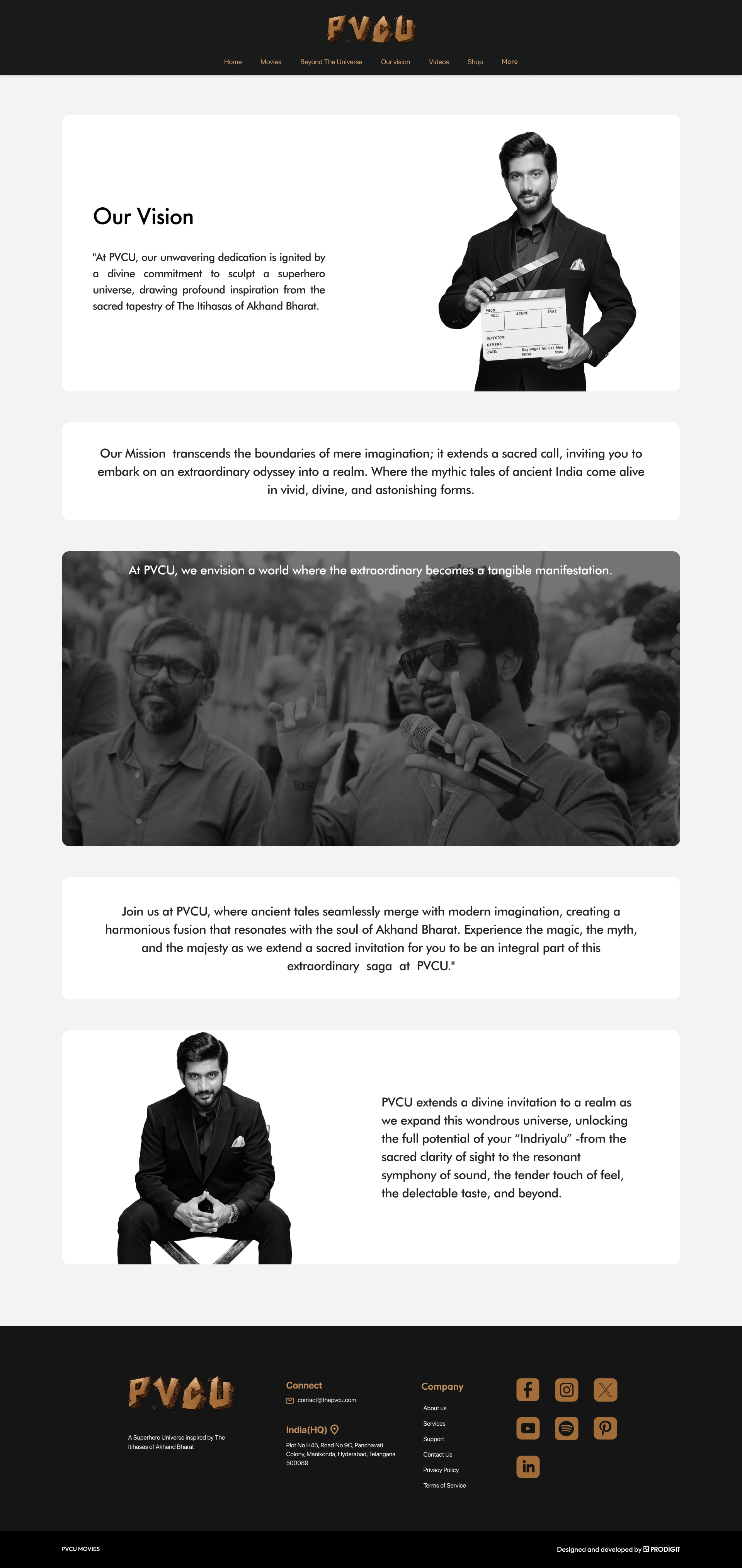
There's a distinct need for a site that organizes a growing catalogue of films — and sells real merchandise — without making fans feel like they're browsing a database.
A visitor might land on PVCU for very different reasons — they just watched Hanu-Man and want to know what's next, they heard about Jai Hanuman, they want to explore Prasanth Varma's earlier films, or they came for the merch. Early explorations also surfaced a second problem: a lot of rich visual content competing for the same attention.
The site needed to hold cinematic storytelling, straightforward information discovery, and a working Shop at the same time — without any one of them crowding out the others.
Competitive Analysis
Because PVCU's job is closer to "help someone understand and explore a catalogue of films" than "promote a single product," I benchmarked it against IMDb specifically — how it organizes movie information, cast and crew, ratings, images and trailers around a single title.
IMDb
Structured, predictable movie metadata; fast scanning of cast, crew and ratings
Information-dense, minimal cinematic immersion — every title looks and feels the same
PVCU opportunity
No sense that titles belong to a connected universe — every film is an island
A clear tier above individual films — "PVCU" vs. "Beyond The Universe" — with one template underneath both
User Interviews
I spoke directly with real users interested in movies and cinematic-universe content to understand what they'd expect from a site like this — real conversations, not a distributed questionnaire.
Quick access over completeness
People wanted to get to movie information and media fast, without wading through everything the site had to offer first.
Feeling overwhelmed was the risk
With this much visual content — posters, trailers, photos, cast, crew — the real UX risk wasn't a missing feature, it was clutter.
Hierarchy over volume
The response wasn't to remove content, but to order it: structured essentials up top, deeper media and universe context progressively below.
Information Architecture
The research pointed toward a two-tier structure — PVCU's core universe separated from the director's wider filmography — with a single, reusable template underneath every film so the system could keep growing without a redesign per title.
From structure to layout, before any visual design.
The homepage hierarchy, movie discovery, movie-detail layout, and cast/crew sections all went through real low-fidelity wireframes before moving into high-fidelity UI.
Note: original files from this stage of the project are a few years old and no longer survive — the wireframes below are reconstructed from memory rather than the original exports.
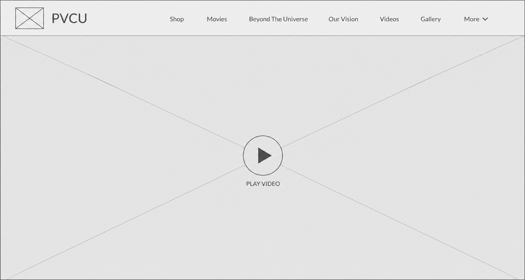
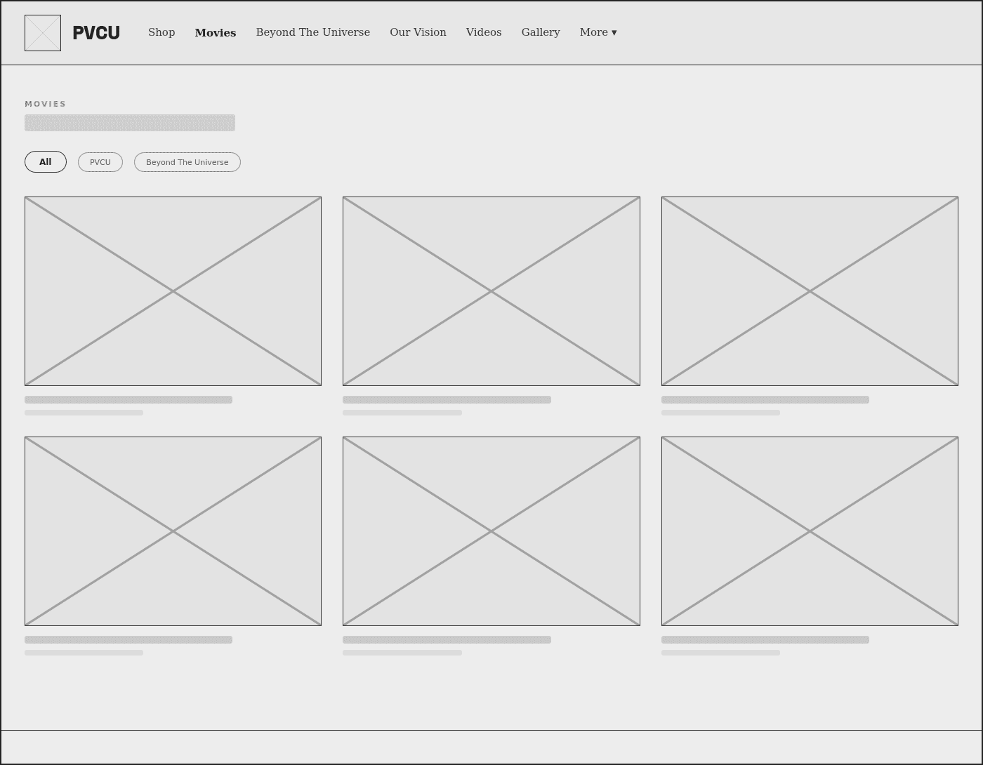
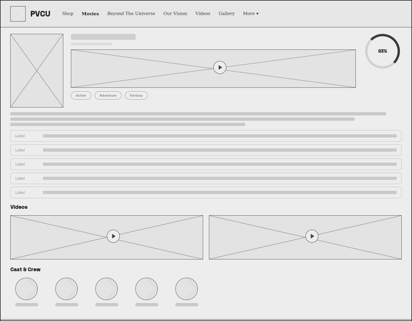
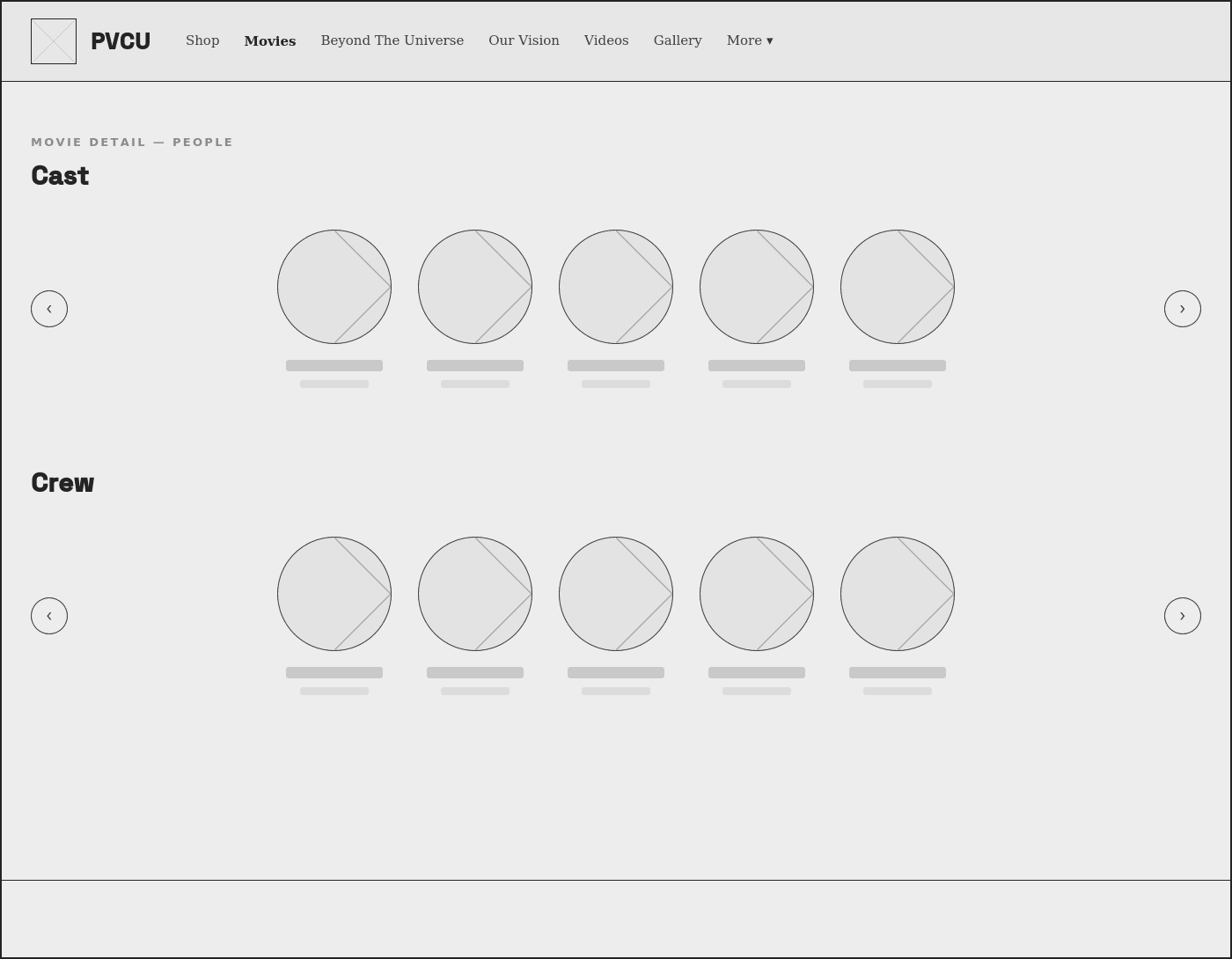
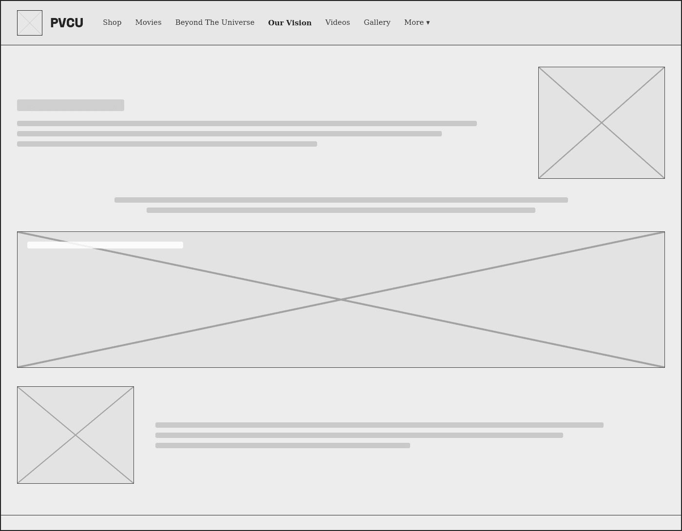
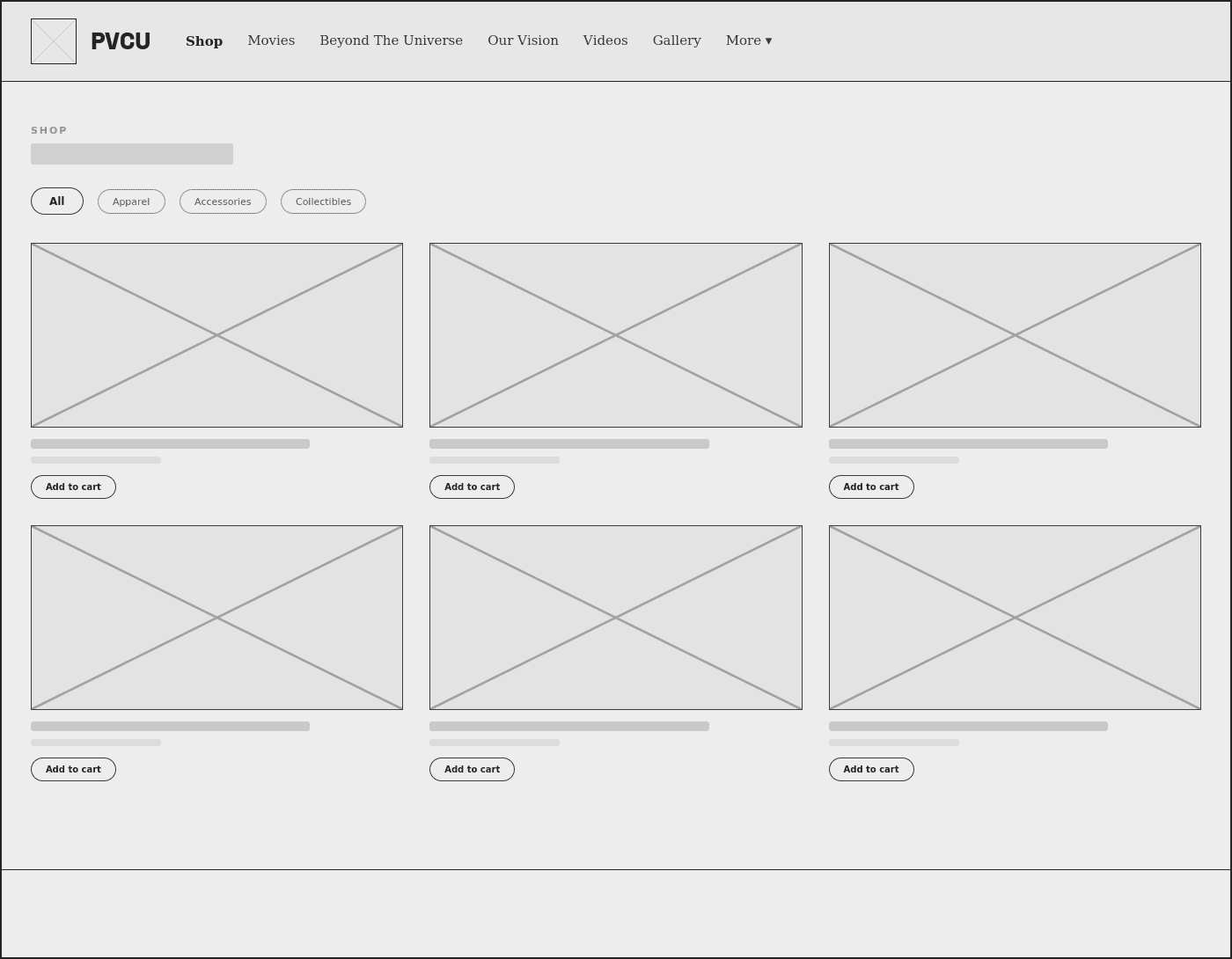
Six titles, one template — and one page that breaks from it on purpose.
Once the structure was validated, the same movie-hub template had to carry very different films — a teaser-stage title, a modest 2018 release, and a 2024 box-office hit — without a redesign per title.
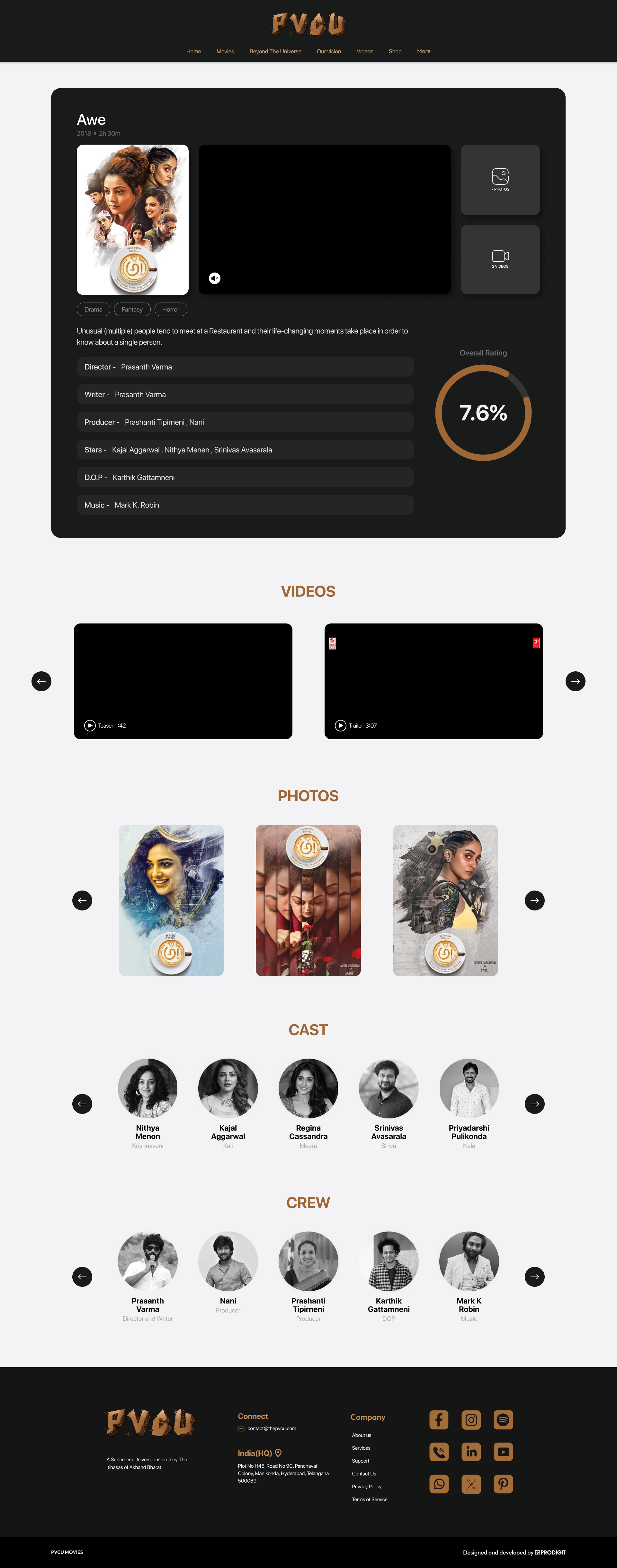
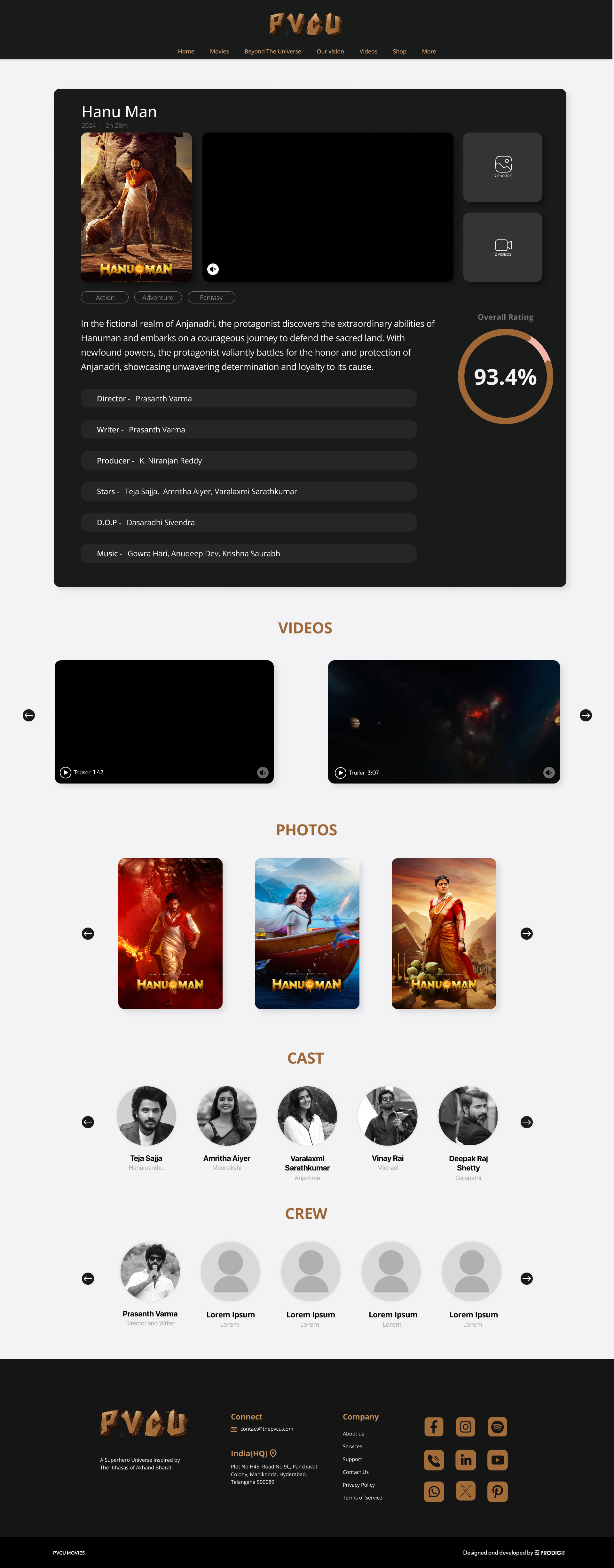
Built for web first, designed to hold up on mobile.
The same movie-hub template, homepage hierarchy and Shop had to work at phone width without losing the cinematic feel. Slots below are placeholders — drop the matching screenshots in and they'll replace these automatically.

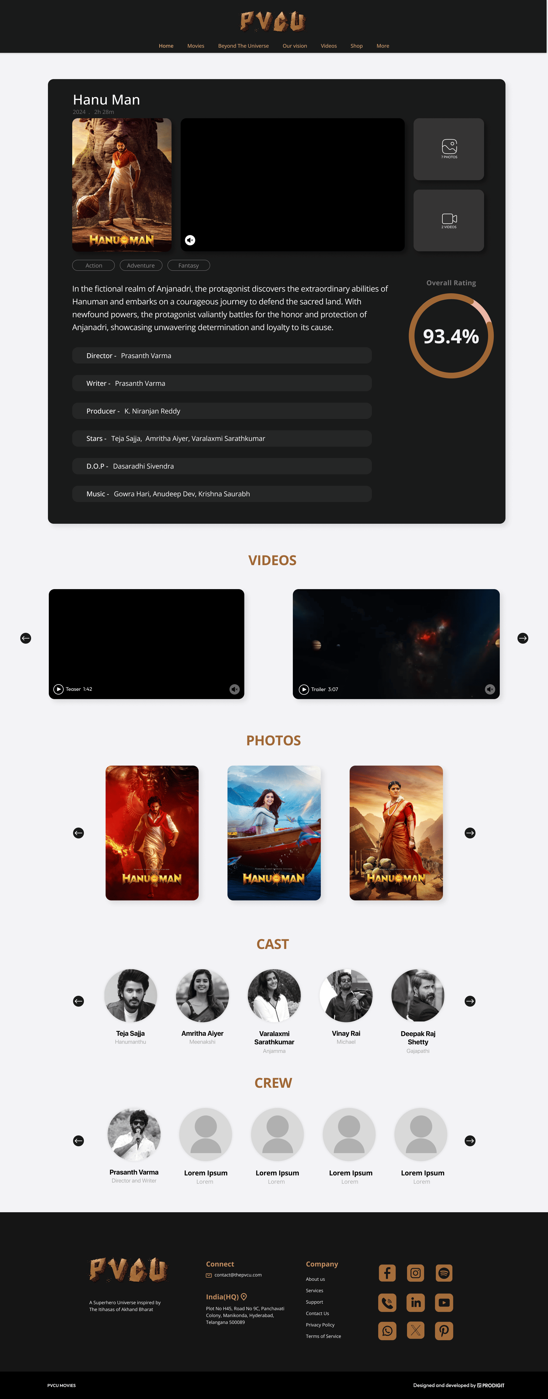

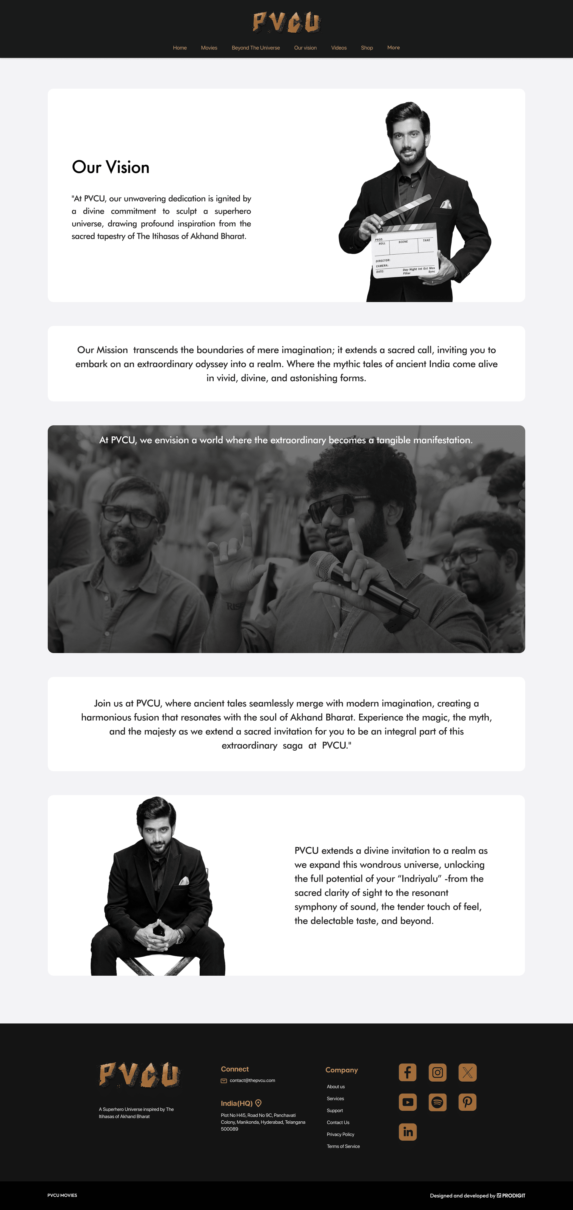

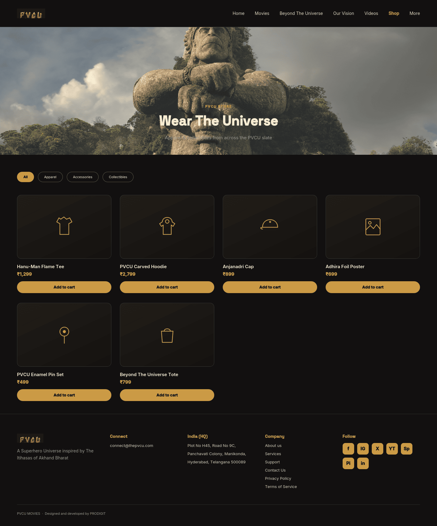
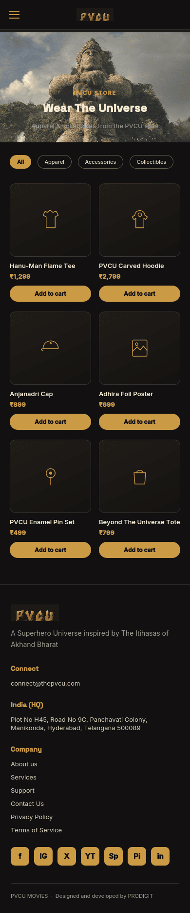
Testing with real movie fans before launch.
Before finalizing the experience, I tested the site with a small group from a movie-focused fanbase — people who regularly consume movie and entertainment content — and asked them to explore naturally: discover films, find trailers, check movie information, and look up cast and crew.
Participants responded positively to the cinematic visual direction and were able to navigate between movie discovery, media, and detailed film information. Their feedback helped validate the poster-led discovery approach and the organization of trailers, photos, cast, and crew content.
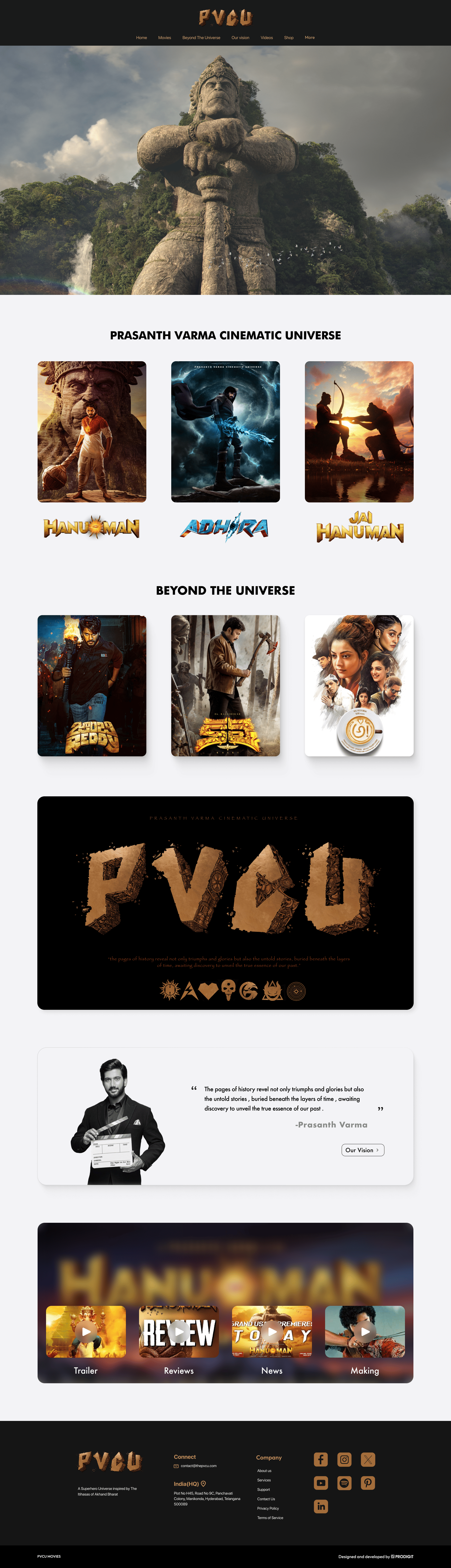
A dark, carved-metal shell built to frame each film's own key art.
The interface stays almost entirely out of the way — near-black panels, restrained bronze type, hairline dividers — so that each film's poster, title treatment and colour story can do the talking at full strength.
Small system, real function. The overall-rating ring on each movie hub is a lightweight SVG component driven by a single score value — reused across every title without a redesign per film.
One quiet, non-negotiable moment. Halfway down the homepage sits a single black plate: the carved-bronze PVCU wordmark beside a line from Prasanth Varma on why the studio exists.
From a folder of film pages to a scalable digital universe.
The final solution turned PVCU from a collection of individual film pages into a reusable system: one movie-hub template that holds a teaser-stage title, a modest 2018 release, and a 2024 box-office hit side by side, with poster-led discovery and progressive disclosure carrying fans from a film they recognize into its story, media, cast and crew.
- One movie-hub template now covers teaser, released and hit titles alike.
- A two-tier catalogue (PVCU / Beyond The Universe) makes the universe legible without a diagram.
- Reusable credits, rating, cast and crew components across the slate.
- Usability testing validated poster-led discovery ahead of launch.
- The Shop sits inside the same system rather than as a bolted-on storefront.
- The full experience was designed responsively across web and mobile.
PVCU taught me
Cinematic design isn't about filling an interface with dramatic visuals — it's about knowing when storytelling should lead and when the interface needs to get out of the way. Research and testing pulled the design toward a clearer system where posters carry discovery, movie pages carry structured information, and reusable components let each film keep its identity without breaking the whole.
What I'd explore next: an interactive map of how films and characters relate, dedicated character pages, a timeline for chronology, search as the library grows, and formal accessibility validation across keyboard and screen-reader use.